
What “nomogram” can mean
In neonatal bilirubin care, the word nomogram is used broadly. It may refer to an hour-specific risk-prediction plot or to treatment-threshold graphs for phototherapy and exchange transfusion. Those are not the same clinical tool.
Before interpreting any plotted result, identify the source guideline, intended population, measurement units, gestational-age assumptions, risk-factor assumptions, and whether the curves predict risk or indicate treatment thresholds.
Do not transfer a measurement from one framework to another or treat an older risk-zone label as an AAP 2022 treatment recommendation. Use the chart specified by the current guideline and local protocol.
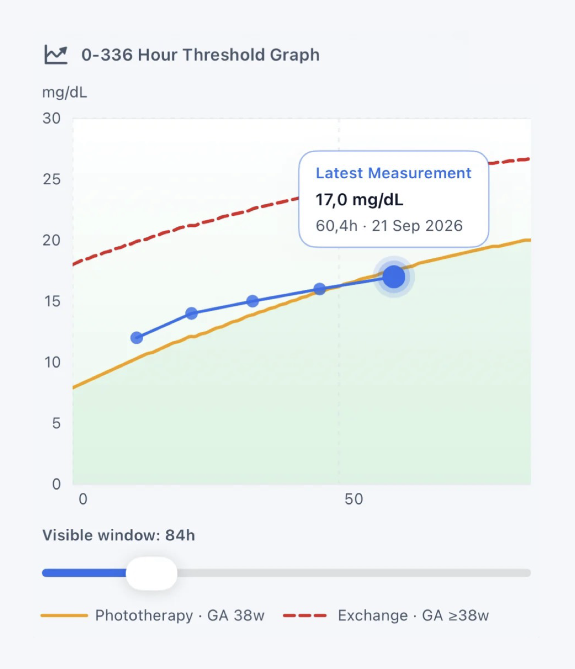
Anatomy of a treatment-threshold graph
| Graph element | What it represents | Interpretation check |
|---|---|---|
| X-axis | Postnatal age in hours at the time bilirubin was measured. | Calculate from the recorded birth and collection times. |
| Y-axis | Bilirubin concentration in the stated unit. | Confirm whether the chart uses mg/dL or micromol/L. |
| Patient marker | The measured bilirubin at a specific age. | Verify method, timestamp, and units. |
| Phototherapy curve | The applicable phototherapy treatment boundary from the selected framework. | Confirm gestational age and risk context. |
| Exchange curve | The applicable exchange transfusion boundary. | Consult the full guideline, including escalation recommendations. |
| Serial line | A visual connection between measurements over time. | Review the actual rate and intervals; visual slope depends on chart scale. |
A disciplined reading sequence
- Name the framework. Confirm AAP 2022, NICE CG98, or another local/national guideline.
- Confirm eligibility. Check that the infant falls within the population covered by the selected chart.
- Confirm the inputs. Verify gestation, postnatal age, units, measurement method, and relevant risk factors.
- Locate the patient value. Read the exact age and bilirubin rather than estimating from a screenshot.
- Compare with the correct curves. Assess the distance and direction relative to treatment thresholds.
- Add trajectory and clinical context. Review prior results, rate of rise, symptoms, feeding, treatment, and follow-up feasibility.
AAP 2022 and NICE CG98
Both frameworks use bilirubin concentration, age in hours, and gestational maturity, but they differ in scope, chart construction, units commonly displayed, and how additional risk is incorporated. A visual graph does not remove those differences.
Clinical status should never be communicated by color alone. Labels, line styles, values, and a written classification help preserve meaning for color-vision differences, monochrome printing, and low-quality displays.
NeoBili Pro example
See the full 0–336 hour threshold view
Plot serial measurements while retaining the selected guideline, measurement details, and distinct treatment boundaries.
View NeoBili Pro on the App Store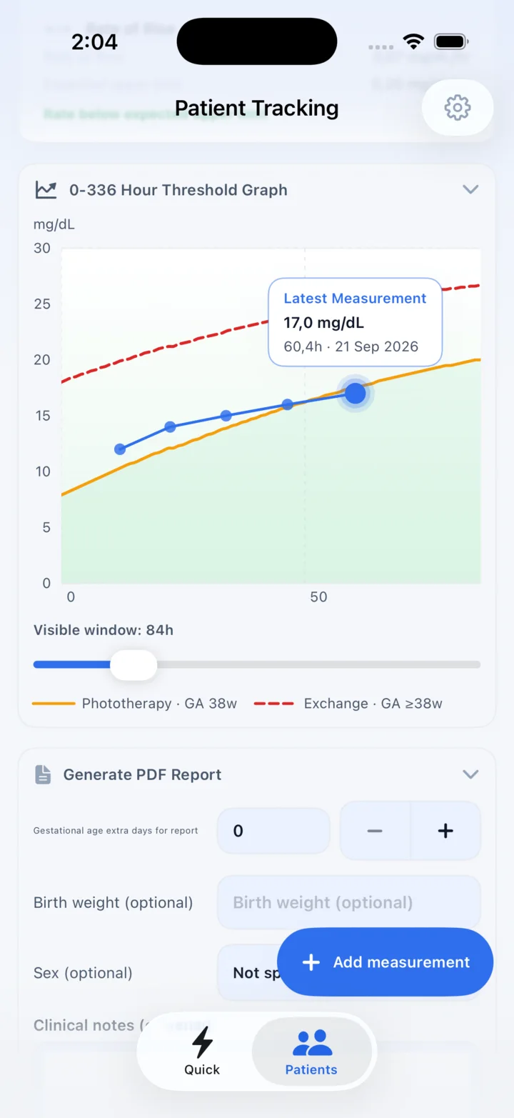
Official references
- AAP 2022 Clinical Practice Guideline ↗Contains the AAP phototherapy, escalation-of-care, and exchange transfusion threshold figures.
- NICE CG98 recommendations and treatment-threshold graphs ↗Includes the threshold table and gestational-age-specific treatment graphs.